Types of Graphs
Once children become excited by an idea, they often want to test and compare it, which can involve collecting some data. An example is measuring the distances travelled by rolling cars down ramps. Once the children have collected data, there are many ways for them to display it.
There are many ways of displaying data; the preferred method will depend on the type of data collected. There are two main types of data: quantitative and qualitative. To learn more about these types of data, see our article on different types of data or click on the section below for a summary.
Click here to learn about the different types of data
Quantitative data can be recorded using a number. This data could be discrete, taking only specific values from the real numbers, such as whole numbers. Some quantitative data can be continuous, taking any value from the real numbers.
The other type of data we can collect is qualitative data. This is non-numerical data, such as a person’s favourite animal or the colour of a car.
To showcase the different types of graphs, we will use the pretend data, which you can see below. This includes some children’s height, shoe size and favourite animal. We also use another pretend dataset, which records the height of a sunflower over time.
Click here to see the data
Data of a pretend sample of students:
| Height (cm) | Shoe Size | Favorite Animal |
|---|---|---|
| 106.3 | 8.5 | dog |
| 99.1 | 7.5 | cat |
| 106.7 | 9 | hamster |
| 109.5 | 11 | dog |
| 95.8 | 7 | cat |
| 104.4 | 8 | dog |
| 108.9 | 10 | dog |
| 109.3 | 10.5 | cat |
| 99.4 | 7 | hamster |
| 102.2 | 9 | dog |
| 105.5 | 8.5 | cat |
| 106.9 | 10 | dog |
| 109.5 | 10 | hamster |
| 100.7 | 9 | cat |
| 95.1 | 7.5 | dog |
| 104.4 | 9.5 | hamster |
| 105.3 | 9.5 | dog |
| 95.9 | 7 | cat |
| 109.9 | 10.5 | dog |
| 94.2 | 7 | dog |
Hypothetical data of sunflower growth:
| Week | Height (cm) |
|---|---|
| 1 | 6 |
| 2 | 14 |
| 3 | 33 |
| 4 | 52 |
| 5 | 75 |
| 6 | 103 |
| 7 | 146 |
| 8 | 187 |
| 9 | 221 |
| 10 | 254 |
Once we have collected our data, we can display it through a variety of graphs. We can present this data in the following ways.
Pie Charts
Firstly, we could create a pie chart of the children’s favourite animals, which is shown below. A pie chart is a popular way of illustrating qualitative data which can be grouped. We can also use pie charts to represent proportions. For example if I spent \(2\) days in a week resting, \(3\) days working on maths and \(2\) days working on english, I could represent this in a pie chart with sections of sizes \(\frac{2}{7}\), \(\frac{3}{7}\) and \(\frac{2}{7}\). Pie charts are a nice way for children to start comparing data, as they can make conclusions using only the size of the sections.

Bar Charts
Next, we could consider bar charts, which are again very useful for comparing qualitative data. Below, we can see a bar chart of the children’s favourite animals. Bar charts can sometimes make comparisons between categories easier than pie charts, as children can draw lines to compare the height of each bar. It is often easier to notice and compare a difference in length than a difference in angle.

Pictographs
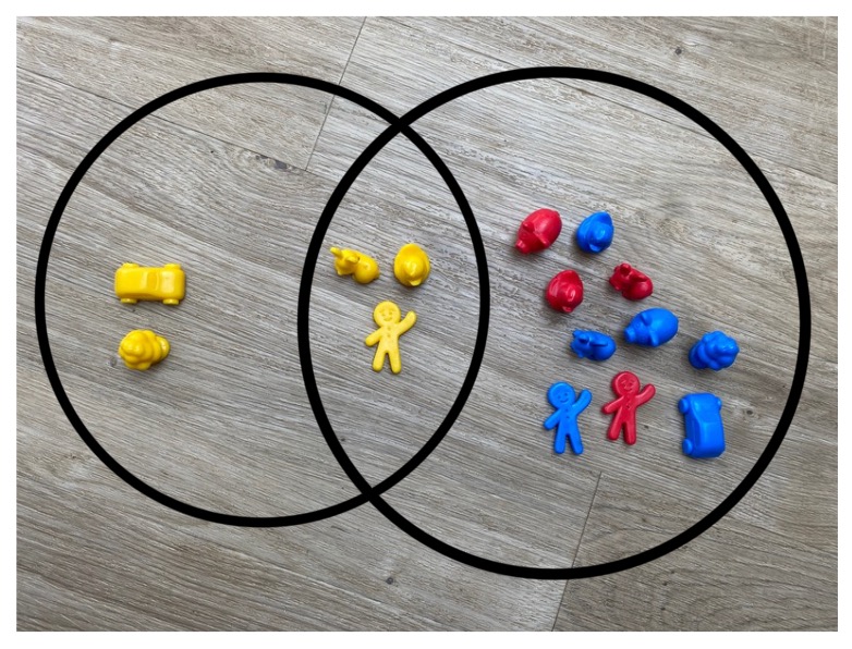
Another engaging way of displaying data is with a pictograph. Here, by letting an image denote a set amount of objects, children can visually represent the data in the same way a tally might be used. A pictograph for the children’s favourite animals is shown below. Children could make their own pictographs using objects in the nursery. It could be fun to make a pictograph to show the colours of different toys using the toys themselves, as shown with cars in the image below.


Histograms
If we want to display quantitative data, there are some other methods we could use. The histogram is very similar to the bar chart; here we group the continuous data into bins so that we can visualise the trends.
How wide should the bins be?
How wide we choose the bins can change the shape of the histogram, and choosing the “best size” of the bins can require quite a lot of complex maths. For classroom experimenting, many reasonable choices can be made for the binwidths; it could be a fun activity to try out a few. Below is a histogram for the heights of the children where the binwidth is \(2\)cm.

Scatterplots
If we have two measurements of quantitative data, such as height and shoe size, we can plot both at the same time to see if there seems to be a relationship between the two. Below we can see a scatterplot with height on the y-axis and shoe size on the x-axis. Often, a line of best fit is drawn to visualise the pattern in the data. A line of best fit tries to be as close to all the points as possible. Again, to plot the actual line of best fit, some maths can be used behind the scenes, but approximations are fine here.

From the data and the line of best fit in the scatterplot, we might think or infer that height and shoe size are positively correlated (meaning that as one increases, so does the other). Sometimes it is tempting to say an increase in one variable causes an increase in another variable; however, it is important to notice that this is not necessarily the case, and there could be other factors affecting our measurements. A common phrase that sums this up is correlation does not mean causation.
It could be interesting to see what other measurements children think should be considered when gathering data. Some extra measurements that might be interesting in this case could include the age of the children in the sample.
Venn Diagrams
A way of looking at the different groups in the data is to use a Venn diagram, as shown below. Here we can see how many of the children fall into the categories of taller than 100cm, shoe size less than 10 and favourite animal being a dog.

Line Graphs
If we are working with time data, it is common to use a line graph to show how a measurement changes over time. If we consider the time data shown in the table at the bottom of the page, we can plot how the height of a sunflower changes over \(11\) weeks. The line graph for this data is shown below. We can see that, as expected, the height of the sunflower increased each week. Children could track the growth of plants, the daily temperature or even their heights throughout the school year.